The distance between the upper quartile and the lower quartile is called the interquartile range. Quartile deviation is half the distance between the two quartiles, i.e. half the interquartile range. It is also called the semi interquartile range. To display the quartile deviation, set showQD='1'. By default, the quartile deviation is represented by a triangle icon in the data plot.
This attribute can be used in all the three elements (<chart>, <dataset> and <set>).
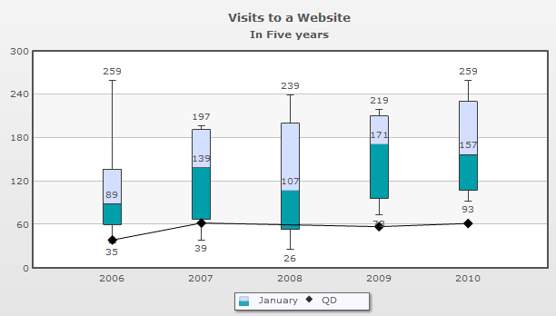
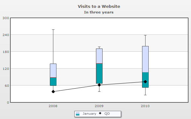
A chart displaying the quartile deviation is shown below:
In the above screenshot, the chart is displaying the quartile deviation icons of each and every data plot. This icon is customizable about which we will discuss later.
The setting for the above chart is given below:
In the above XML, the showQD attribute is set to '1' in the <chart> element. So, all the dataplots are displaying the quartile deviation icon. The attribute QDIconSides is set to '4' to display the icon as a quadrangle. By default, the icon will appear as a triangle.
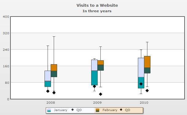
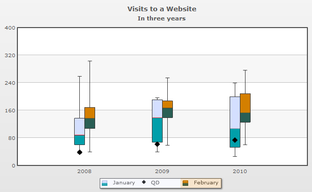
You may want to display the quartile deviation icon of one data-set and hide the other. To do this use the showQD attribute in the <dataset> element. A sample data is given below:
<chart caption='Visits to a Website' subCaption='In three years' showValues='0' QDIconSides='4'>
...
<dataset seriesName="January" lowerBoxColor='009FAA' upperboxColor='D4DFFF' mediancolor='FF0000' showQD='1'>
    <set value='60,133,35,67,89,137,259'/>
    <set value='139,67,75,114,39,67,191' />
    <set value='200,107,197,239,53,26,97' />
</dataset>

<dataset seriesName="February" lowerBoxColor='2A5F55' upperboxColor='D47F00'>
    <set value='160,303,125,137,169,107,39' />
    <set value='139,167,255,124,59,187,151' />
    <set value='60,137,157,209,153,126,277' />
</dataset>
</chart>
{
"chart":{
"caption":"Visits to a Website",
"subcaption":"In three years",
"showvalues":"0",
"qdiconsides":"4"
},
...
"dataset":[{
"seriesname":"January",
"lowerboxcolor":"009FAA",
"upperboxcolor":"D4DFFF",
"mediancolor":"FF0000",
"showqd":"1",
"data":[{
"value":"60,133,35,67,89,137,259"
},
{
"value":"139,67,75,114,39,67,191"
},
{
"value":"200,107,197,239,53,26,97"
}
]
},
{
"seriesname":"February",
"lowerboxcolor":"2A5F55",
"upperboxcolor":"D47F00",
"data":[{
"value":"160,303,125,137,169,107,39"
},
{
"value":"139,167,255,124,59,187,151"
},
{
"value":"60,137,157,209,153,126,277"
}
]
}
]
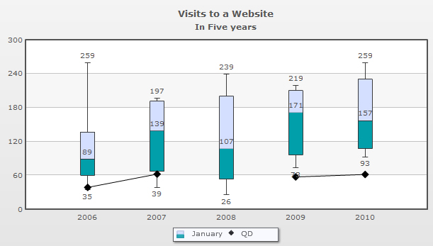
}In the above data, we have used the showQD attribute in only one of the <dataset>element. So, the chart will display the quartile deviation icon for the data plots declared in that <dataset> element. For rest of the dataplots the icon will not be displayed. The chart will look like as under:
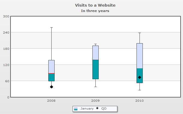
You can also display the quartile deviation icon selectively for any one set of data declared through the <set> elements. The sample is given below:
<chart caption='Visits to a Website' subCaption='In three years' showValues='0' QDIconSides='5'>
...
<dataset seriesName="January" lowerBoxColor='2A5F55' upperboxColor='D47F00' mediancolor='FF0000' >
    <set value='60,133,35,67,89,137,259' showQD='1'/>
    <set value='139,67,75,114,39,67,191' />
    <set value='200,107,197,239,53,26,97' showQD='1'/>
</dataset>
</chart>
{
  "chart":{
    "caption":"Visits to a Website",
    "subcaption":"In three years",
    "showvalues":"0",
    "qdiconsides":"5"
  },
  ...
  "dataset":[{
      "seriesname":"January",
      "lowerboxcolor":"2A5F55",
      "upperboxcolor":"D47F00",
      "mediancolor":"FF0000",
      "data":[{
          "value":"60,133,35,67,89,137,259",
          "showqd":"1"
        },
        {
          "value":"139,67,75,114,39,67,191"
        },
        {
          "value":"200,107,197,239,53,26,97",
          "showqd":"1"
        }
      ]
    }
  ]
}
In the above data, we have set showQD = '1' in two of the <set> elements within the <dataset> element. So, the chart will display the Quartile deviation icon only for the first and the third dataplot. The chart will look like as under:
The attributes used to customize the quartile deviation icon are given below:
| Attribute Name | Type | Range | Description |
| QDIconShape | String | Specifies the shape of the icon. There are two options - polygon and spoke. | |
| QDIconRadius | Number | Specifies the radius of the quartile deviation icon. | |
| QDIconSides | Number | Specifies the number of sides for the icon. If the QDIconShape is set as polygon, then the shape of the icon will depend on the number of sides. For example, 3 sides will display a triangle, 8 will display a circle. | |
| QDIconColor | Hex code | Sets the color of the quartile deviation icon. | |
| QDIconAlpha | Number | 0-100 | Sets the transparency of the quartile deviation icon. |
For multiple dataplots, you can draw a line to connect the quartile deviation icons of each dataplot. The attribute drawQDConnector is set to '1' to connect all the icons of the dataplots. This attribute can be used in <chart> and <dataset> elements. The color of the connecting line will be same as the color of the quartile deviation icon.
The chart will look like as under:
If you set the showQD attribute in any of the <set> element to '0', the chart will not display the quartile deviation icon of that particular set of data. In this case, the missing quartile deviation is considered as null data. Consequently, the quartile deviation connectors will skip this null data.
An example of this situation is shown below:
The data is given below:
<chart caption='Visits to a Website' subCaption='In three years' drawQDConnector='1' QDIconSides='5'>
...
<dataset seriesName="January" lowerBoxColor='2A5F55' upperboxColor='D47F00' mediancolor='FF0000'>
	<set value='60,133,35,67,89,137,259' showQD='1'/>
	<set value='139,67,75,114,39,67,191' showQD='1'/>
	<set value='200,107,197,239,53,26,97' showQD='0'/>
	<set value='210,117,187,219,73,96,171' showQD='1'/>
	<set value='230,107,157,259,93,116,191' showQD='1'/>
</dataset>
</chart>
{
  "chart":{
    "caption":"Visits to a Website",
    "subcaption":"In three years",
    "drawqdconnector":"1",
    "qdiconsides":"5"
  },
  ...
  "dataset":[{
      "seriesname":"January",
      "lowerboxcolor":"2A5F55",
      "upperboxcolor":"D47F00",
      "mediancolor":"FF0000",
      "data":[{
          "value":"60,133,35,67,89,137,259",
          "showqd":"1"
        },
        {
          "value":"139,67,75,114,39,67,191",
          "showqd":"1"
        },
        {
          "value":"200,107,197,239,53,26,97",
          "showqd":"0"
        },
	{
          "value":"210,117,187,219,73,96,171",
          "showqd":"1"
        },
        {
          "value":"230,107,157,259,93,116,191",
          "showqd":"1"
        }
      ]
    }
  ]
}
In the above data:
- The showQD attribute is set to '0' in the third <set> element to hide the quartile deviation icon
- The drawQDConnector is set to '1' to connect the icons
The quartile deviation connector in the above chart is drawn as a discontinuous line.
You can opt to ignore the null data and draw a continuous connector. To achieve this, set connectNullData = '1'. In our above example, the chart will draw the line connecting the quartile deviation icons of the first, second and the fourth, fifth dataplots skipping the third dataplot. This attribute can only be used in the <chart> element.
The chart will look like as under: