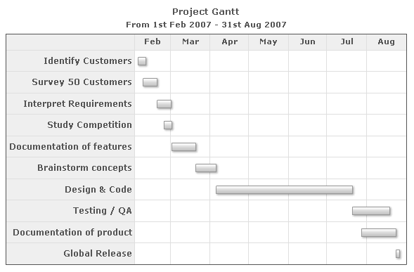
<chart dateFormat="mm/dd/yyyy" caption="Project Gantt" subCaption="From 1st Feb 2007 - 31st Aug 2007">
  <categories>
    <category start="02/01/2007" end="03/01/2007" label="Feb"/>
    <category start="03/01/2007" end="04/01/2007" label="Mar"/>
    <category start="04/01/2007" end="05/01/2007" label="Apr"/>
    <category start="05/01/2007" end="06/01/2007" label="May"/>
    <category start="06/01/2007" end="07/01/2007" label="Jun"/>
    <category start="07/01/2007" end="08/01/2007" label="Jul"/>
    <category start="08/01/2007" end="09/01/2007" label="Aug"/>
  </categories>
  <processes fontSize="12" isBold="1" align="right">
    <process label="Identify Customers"/>
    <process label="Survey 50 Customers"/>
    <process label="Interpret Requirements"/>
    <process label="Study Competition"/>
    <process label="Documentation of features"/>
    <process label="Brainstorm concepts"/>
    <process label="Design & Code"/>
    <process label="Testing / QA"/>
    <process label="Documentation of product"/>
    <process label="Global Release"/>
  </processes>
  <tasks>
    <task start="02/04/2007" end="02/10/2007"/>
    <task start="02/08/2007" end="02/19/2007"/>
    <task start="02/19/2007" end="03/02/2007"/>
    <task start="02/24/2007" end="03/02/2007"/>
    <task start="03/02/2007" end="03/21/2007"/>
    <task start="03/21/2007" end="04/06/2007"/>
    <task start="04/06/2007" end="07/21/2007"/>
    <task start="07/21/2007" end="08/19/2007"/>
    <task start="07/28/2007" end="08/24/2007"/>
    <task start="08/24/2007" end="08/27/2007"/>
  </tasks>
</chart>
{
  "chart": {
    "dateformat": "mm/dd/yyyy",
    "caption": "Project Gantt",
    "subcaption": "From 1st Feb 2007 - 31st Aug 2007"
  },
  "categories": [
    {
      "category": [
        {
          "start": "02/01/2007",
          "end": "03/01/2007",
          "label": "Feb"
        },
        {
          "start": "03/01/2007",
          "end": "04/01/2007",
          "label": "Mar"
        },
        {
          "start": "04/01/2007",
          "end": "05/01/2007",
          "label": "Apr"
        },
        {
          "start": "05/01/2007",
          "end": "06/01/2007",
          "label": "May"
        },
        {
          "start": "06/01/2007",
          "end": "07/01/2007",
          "label": "Jun"
        },
        {
          "start": "07/01/2007",
          "end": "08/01/2007",
          "label": "Jul"
        },
        {
          "start": "08/01/2007",
          "end": "09/01/2007",
          "label": "Aug"
        }
      ]
    }
  ],
  "processes": {
    "fontsize": "12",
    "isbold": "1",
    "align": "right",
    "process": [
      {
        "label": "Identify Customers"
      },
      {
        "label": "Survey 50 Customers"
      },
      {
        "label": "Interpret Requirements"
      },
      {
        "label": "Study Competition"
      },
      {
        "label": "Documentation of features"
      },
      {
        "label": "Brainstorm concepts"
      },
      {
        "label": "Design & Code"
      },
      {
        "label": "Testing / QA"
      },
      {
        "label": "Documentation of product"
      },
      {
        "label": "Global Release"
      }
    ]
  },
  "tasks": {
    "task": [
      {
        "start": "02/04/2007",
        "end": "02/10/2007"
      },
      {
        "start": "02/08/2007",
        "end": "02/19/2007"
      },
      {
        "start": "02/19/2007",
        "end": "03/02/2007"
      },
      {
        "start": "02/24/2007",
        "end": "03/02/2007"
      },
      {
        "start": "03/02/2007",
        "end": "03/21/2007"
      },
      {
        "start": "03/21/2007",
        "end": "04/06/2007"
      },
      {
        "start": "04/06/2007",
        "end": "07/21/2007"
      },
      {
        "start": "07/21/2007",
        "end": "08/19/2007"
      },
      {
        "start": "07/28/2007",
        "end": "08/24/2007"
      },
      {
        "start": "08/24/2007",
        "end": "08/27/2007"
      }
    ]
  }
}
|
Back to top 
|
|
Object Name |
Description |
Features Supported |
Animation Parameters Supported |
| BACKGROUND |
Background refers to the background for entire chart. |
- Animation
- Shadow
- Glow
- Bevel
- Blur
|
- _alpha
- _x
- _y
- _xScale
- _yScale
|
| CANVAS |
The entire area inside which the Gantt chart is plotted. |
- Animation
- Shadow
- Glow
- Bevel
- Blur
|
- _alpha
- _x
- _y
- _xScale
- _yScale
|
| CAPTION |
Caption of the chart. |
- Animation
- Font
- Shadow
- Glow
- Bevel
- Blur
|
|
| SUBCAPTION |
Sub-caption of the chart. |
- Animation
- Font
- Shadow
- Glow
- Bevel
- Blur
|
|
| TASKS |
All the task bars being shown on the chart. |
- Animation
- Shadow
- Glow
- Bevel
- Blur
|
|
| TASKLABELS |
Labels of the task bar. |
- Animation
- Font
- Shadow
- Glow
- Bevel
- Blur
|
|
| TASKDATELABELS |
Date labels for each task bar (both start and end date) |
- Animation
- Font
- Shadow
- Glow
- Bevel
- Blur
|
|
| MILESTONES |
All the milestones plotted on the chart. |
- Animation
- Shadow
- Glow
- Bevel
- Blur
|
- _alpha
- _x
- _y
- _xScale
- _yScale
|
| CONNECTORS |
All the connectors that have been drawn to connect different tasks. |
- Animation
- Shadow
- Glow
- Bevel
- Blur
|
|
| TRENDLINES |
All the trend lines or trend zones drawn on the chart. |
- Animation
- Shadow
- Glow
- Bevel
- Blur
|
|
| TRENDVALUES |
Display label of the trend lines or trend zones drawn on the chart. |
- Animation
- Font
- Shadow
- Glow
- Bevel
- Blur
|
|
| TOOLTIP |
Tooltip for the chart. |
|
|
| LEGEND |
Legend for the chart. |
- Animation
- Font
- Shadow
- Glow
- Bevel
- Blur
|
|
|
Back to top |
|
Attribute Name |
Type |
Description |
| dateFormat |
mm/dd/yyyy or dd/mm/yyyy or yyyy/mm/dd |
This attribute helps you specify the input date format for all the dates in your XML. This is a mandatory attribute to specify and once specified, all the dates in your XML data should conform to the format specified herein. |
| outputDateFormat |
String |
You can also specify how the dates look on your Gantt chart using this attribute. This attribute takes the output date format as string. You can build your own output date format string as explained in the section "Configuring date formats". |
| ganttPaneDuration |
Number |
If you want your Gantt pane to scroll through a specified time line, you can use this attribute to set what timeline the pane will represent. For example, if you want your Gantt pane to show date only for 3 months and then scroll the rest, you can set this attribute as 3. More of this has been explained in the section "Enabling scroll". |
| ganttPaneDurationUnit |
String - y,m,d, h, mn or s |
If you've opted to scroll the Gantt pane, this attribute lets you choose the unit of your specified duration. More of this has been explained in the section "Enabling scroll". |
| showFullDataTable |
Boolean (0/1) |
Whether to show full names of the process labels and data columns in grid. If you set this as on, the labels will not wrap and always show in full. When required, a scroll bar will automatically appear for the entire grid. |
| ganttWidthPercent |
Number (10-100) |
You can opt to set the width of the Gantt view pane in percent using this attribute. The rest of the width will be taken by the grid. If the data grid takes lesser space, the chart will automatically adjust the Gantt pane to assume more width. |
| forceGanttWidthPercent |
Boolean (0/1) |
If you want the chart to never automatically adjust the Gantt width and stick to the percent width that you've specified, you can set this attribute to 1. |
| caption |
String |
Caption for the chart. |
| subCaption |
String |
Sub-caption for the chart. |
| showTaskStartDate |
Boolean |
For each task bar in the Gantt chart, you can show its respective start date on its left. To do so, set this attribute as 1. |
| showTaskEndDate |
Boolean |
For each task bar in the Gantt chart, you can show its end date value too by setting this attribute as 1. |
| showTaskLabels |
Boolean (0/1) |
Whether to show task labels for each task bar in the Gantt chart. The task labels show up only if they've been defined for the task. |
| showPercentLabel |
Boolean (0/1) |
If you've used the percentage task feature, you can opt to show the percent complete for each task as part of the task label by setting this attribute as 1. |
| showSlackAsFill |
Boolean |
If you've used the percentage task feature, you can opt to show the slack (percent of work not completed) as either a filled bar or empty bar. To draw as empty bars, set this attribute as 0. |
| slackFillColor |
Hex Color |
If you've opted to fill the slack bars with color, you can define the color code for the same here. |
| animation |
Boolean |
Whether to animate the chart while rendering? If you define this attribute as 0, even your custom defined Style animations will not work. |
| defaultAnimation |
Boolean |
Whether to use the default animations specified in the chart? This can be specifically useful when you want to disable the default animations and then define your own custom animations using Styles. |
| clickURL |
String URL |
Click URL for the entire chart. The entire chart can then act as a hotspot. This URL can be provided in FusionCharts Link format. |
| annRenderDelay |
Number (time in seconds) |
If you've defined any annotation groups to be rendered over the chart, using this attribute you can control the time duration after which they'll appear on the chart. |
| extendCategoryBg |
Boolean |
If you set this attribute as 1, the Gantt pane grid will take the same background and border properties as that of the last category (visual dateline) defined. |
| showPrintMenuItem |
Boolean (0/1) |
Whether to show "Print Chart" item in the context menu of the chart? Even if you opt to hide the item in context menu, you can still opt to invoke print() JavaScript method of the chart to print the same. |
| showAboutMenuItem |
Boolean (0/1) |
Setting this to 1 displays a custom context menu in the chart, which can be customized to show your text and can be linked to your URL. For e.g., you can set the context menu of the chart to include "About your company name" and then link to your company home page. By default, the chart shows "About FusionCharts" when right clicked. |
| aboutMenuItemLabel |
String |
The menu item label for the custom context menu item. |
| aboutMenuItemLink |
String |
Link for the custom context menu item. You can specify the link in FusionCharts link format to be able to open the same in new window, pop-ups, frames or as JavaScript links. |
|
Back to top |
| palette |
Number (1-5) |
Which pre-defined color palette to use? |
| paletteThemeColor |
Hex Code |
If you want your own palette derived from a particular hex color, you can specify the same here. All other colors on the chart will automatically derive from that palette. |
| bgColor |
Color |
This attribute sets the background color for the chart. You can set any hex color code as the value of this attribute. To specify a gradient as background color, separate the hex color codes of each color in the gradient using comma. Example: FF5904, FFFFFF. Remember to remove # and any spaces in between. For more details see Using Gradients. |
| bgAlpha |
Number (0-100) |
Sets the alpha (transparency) for the background. If you've opted for gradient background, you need to set a list of alpha(s) separated by comma. For more details see Using Gradients. |
| bgRatio |
String of numbers (0-100) |
If you've opted for a gradient background, this attribute lets you set the ratio of each color constituent. For more details see Using Gradients. |
| bgAngle |
Number (0-360) |
Angle of the background color, in case of a gradient. For more details see Using Gradients. |
| showBorder |
Boolean (0/1) |
Whether to show a border around the chart or not? |
| borderColor |
Color Code |
Border color of the chart. |
| borderThickness |
Number |
Border thickness of the chart. |
| borderAlpha |
Number (0-100) |
Border alpha of the chart. |
| bgImage
or
bgSWF - deprecated
|
String |
To place any image (JPG/PNG/GIF) or Flash movie (SWF) as background of the chart, enter the (path and) name of the background image or SWF file. It should be in the same domain as the chart. Loading of Flash movie is deprecated and is not supported by JavaScript charts. |
| bgImageAlpha
or
bgSWFAlpha - deprecated
|
Number (0-100) |
Helps you specify the opacity for the loaded background image or Flash movie. Loading of Flash movie is deprecated and is not supported by JavaScript charts. |
|
bgImageDisplayMode Since v3.2 |
String (stretch, tile, fit, fill, center, none) |
Helps you specify the mode in which the background image is to be displayed.
- Stretch - expands the image to fit the entire chart area, without maintaining original image constraints
- Tile - the image is repeated as a pattern on the entire chart area
- Fit - fits the image proportionately on the chart area
- Fill -proportionately fills the entire chart area with the image
- Center - the image is positioned at the center of the chart area
- None - Default mode. None of the above modes are applied
For more details click here. |
|
bgImageVAlign Since v3.2 |
String (top, middle, bottom) |
Helps you to vertically align the background image. |
|
bgImageHAlign Since v3.2 |
String (left, middle, right) |
Helps you to horizontally align the background image. |
|
bgImageScale Since v3.2 |
Number (0-300) |
Helps you magnify the background image.This attribute will only work when the attribute bgImageDisplayMode is set to none, center or tile. |
| canvasBgColor |
Color Code |
Sets Canvas background color. For Gradient effect, enter colors separated by comma. |
| canvasBgAlpha |
Number (0-100) |
Sets alpha for Canvas Background. For gradient, enter alpha list separated by comma. |
| canvasBgRatio |
String |
Helps you specify canvas background ratio for gradients. |
| canvasBgAngle |
Number (0-360) |
Helps you specify canvas background angle in case of gradient. |
| canvasBorderColor |
Color Code |
Lets you specify canvas border color. |
| canvasBorderThickness |
Number (pixels) |
Lets you specify canvas border thickness. |
| canvasBorderAlpha |
Number (0-100) |
Lets you control transparency of canvas border. |
| ganttLineColor |
Color Code |
Lets you specify the color in which the grid border for the Gantt pane view will be drawn. |
| ganttLineAlpha |
Number (0-100 ) |
Alpha for the grid border of Gantt view pane. |
| gridBorderColor |
Color Code |
Color for the data grid border. |
| gridBorderAlpha |
Number (0-100) |
Alpha for the data grid border. |
| gridResizeBarColor |
Color Code |
Color for the drag line that appears when resizing the data grid. |
| gridResizeBarThickness |
Number |
Thickness of the drag line that appears when resizing the data grid, |
| gridResizeBarAlpha |
Number (0-100) |
Alpha of the drag line that appears when resizing the data grid. |
| taskBarRoundRadius |
Number |
If you want your task bars to be rounded (when not using percent complete feature), you can set the radius of the round corner here. That'll result in all task bars having rounded corners. |
| taskBarFillMix |
String Gradient Formula |
This attribute lets you specify the gradient fill formula for the task bars. Please refer to the section Advanced Charting > Using Gradients for more details on this. |
| taskBarFillRatio |
String of ratios separated by comma |
If you're using gradient fill formula for the task bars, this attribute lets you specify the ratio for each color in the gradient. Please refer to the section Advanced Charting > Using Gradients for more details on this. |
| baseFont |
Font face name |
Global font face for all text on the chart. You can individually customize font properties of each element using their respective attributes or Styles. |
| baseFontSize |
Number |
Global font size for all text on the chart. |
| baseFontColor |
Color Code |
Global font color for all text on the chart. |
| showShadow |
Boolean (0/1) |
Whether to show shadow for the task bars? |
| logoURL |
String |
You can load an external logo (JPEG/PNG/SWF) on the chart once it has rendered. This attribute lets you specify the URL of the same. Owing to Flash Player security settings, you can only specify logos that are on the sub-domain as the SWF file of the chart. |
| logoPosition |
String ( TL, TR, BL, BR, CC ) |
Where to position the logo on the chart:
- TL - Top-left
- TR - Top-right
- BR - Bottom right
- BL - Bottom left
- CC - Center of screen
|
| logoAlpha |
Number (0-100) |
Once the logo has loaded on the chart, you can configure its opacity using this attribute. |
| logoScale |
Number (0-100) |
You can also change the size of externally loaded logo at run-time by specifying a value for this parameter. |
| logoLink |
String |
If you want to link the logo to an external URL, specify the link in this attribute. The link can be in FusionCharts link format, allowing you to link to new windows, pop-ups, frames etc. |
| manageResize Since v 3.2 |
Boolean (0/1) |
Setting this attribute to 1, you can allow the chart to automatically resize itself when the parent container of the chart is resized. |
| useEllipsesWhenOverflow Since v 3.2
|
Boolean (0/1) |
When enabled in AUTO mode, long data labels are truncated by adding ellipses to prevent them from overflowing the chart background. The default value is 1. |
|
Back to top |
| positionInGrid |
left or right |
Whether the process column appears as the left-most column of data grid or right-most? |
| width |
Number or percent |
Width of the process column in data table. You can either specify it as exact pixels (e.g. 150 or 200) or in percentage (25% or 30%) |
| The processes column can have a header, whose properties can be customized using the attributes below. |
| headertext |
String |
Header label for the processes column in data table. |
| headerFont |
Font face |
Font for the process header |
| headerFontSize |
Number |
Font size for the process header |
| headerFontColor |
Color Code |
Font color for the process header |
| headerIsBold |
Boolean (0/1) |
Whether process header should appear bold? |
| headerIsItalic |
Boolean (0/1) |
Whether process header should appear in italics? |
| headerIsUnderline |
Boolean (0/1) |
Whether process header should appear as underlined? |
| headerAlign |
left, center or right |
Horizontal alignment position of the header label. |
| headerVAlign |
top, middle or bottom |
Vertical alignment position of the header label. |
| headerBgColor |
Color Code |
Background color of the process header. |
| headerBgAlpha |
Number (0-100) |
Background alpha of the process header. |
| The following properties allow you to collectively specify cosmetics for all <process> elements, which can further be specified for each <process> element. |
| bgColor |
Color Code |
Background color for the process name column. |
| bgAlpha |
Number (0-100) |
Background alpha for the process name column. |
| font |
Font Face |
Font for process name. |
| fontSize |
Number |
Font size for process name. |
| fontColor |
Color Code |
Font color for process name. |
| isBold |
Boolean (0/1) |
Whether to show process names in bold? |
| isItalic |
Boolean (0/1) |
Whether to show process names in italics? |
| isUnderline |
Boolean (0/1) |
Whether to show process names as underline? |
| align |
left, center or right |
Horizontal alignment for all process names. |
| vAlign |
top, middle or bottom |
Vertical alignment for all process names. |
|
Back to top |
| start |
Date in the format specified |
Start date for the task in the date format specified in XML. |
| end |
Date in the format specified |
End date for the task in the date format specified in XML. |
| id |
String identifier |
Each task can have its own unique ID. It is used for linking connectors and milestones. |
| processId |
String identifier |
You can relate each task to its process using the process ID, which can be specified here. |
| label |
String |
String label for the task. |
| link |
Link in FusionCharts format |
Link for the task bar (in FusionCharts link format) |
| percentComplete |
Number (0-100) |
Each task can be shown as incomplete task by specifying the percent completed here. |
| showAsGroup |
Boolean (0/1) |
Whether to render the task bar visually as a group? |
| animation |
Boolean (0/1) |
Whether to animate this particular bar? |
| font |
Font face |
Font for the task label. |
| fontColor |
Color Code |
Font color for the task label. |
| fontSize |
Number |
Font size for the task label. |
| color |
Color Code |
Fill color for the task bar. This color is manipulated by the task fill gradient formula to attain the required gradient. |
| alpha |
Number (0-100) |
Fill alpha for the task bar. |
| showBorder |
Boolean (0/1) |
Whether to show border for the task bar? |
| borderColor |
Color Code |
Border color for the task bar. |
| borderThickness |
Number |
Border thickness for the task bar. |
| borderAlpha |
Number (0-100) |
Border alpha for the task bar. |
| height |
In Pixels or Percent |
Height for the task bar either in pixels (e.g., 30 or 25) or in percent (e.g., 25% or 50%) |
| topPadding |
In Pixels or percent |
Padding required at the top of the task bar either in pixels or in percent. |
| showLabel |
Boolean (0/1) |
Whether to show the label for this task bar? |
| showPercentLabel |
Boolean (0/1) |
Whether to include percent complete in the label for this task bar? |
| showStartDate |
Boolean (0/1) |
Whether to show start date for the task bar? |
| showEndDate |
Boolean (0/1) |
Whether to show end date label for the task bar? |
| toolText |
String |
If you want to have custom tool text for each task bar, you can specify it here. |
|
Back to top |
| headerFont |
Font face |
Font face for all column headers in the data table. |
| headerFontSize |
Number |
Font size for all column headers in the data table. |
| headerFontColor |
Color Code |
Font color for all column headers in the data table. |
| headerIsBold |
Boolean (0/1) |
Whether header should appear bold for all column headers in the data table? |
| headerIsItalic |
Boolean (0/1) |
Whether header should appear in italics for all column headers in the data table? |
| headerIsUnderline |
Boolean (0/1) |
Whether header should appear in underline for all column headers in the data table? |
| headerAlign |
left, center or right |
Horizontal alignment position for all column headers in the data table. |
| headerVAlign |
top, middle or bottom |
Vertical alignment position for all column headers in the data table. |
| headerBgColor |
Color Code |
Background color for all column headers in the data table. |
| headerBgAlpha |
Number (0-100) |
Background alpha for all column headers in the data table. |
| The following attributes let you collectively specify the cosmetic properties for all the cells in data table. |
| bgColor |
Color Code |
Background color for all the cells in the data table. |
| bgAlpha |
Number (0-100) |
Background alpha for all the cells in the data table. |
| font |
Font face |
Font for all the cells in the data table. |
| fontColor |
Color Code |
Font color for all the cells in the data table. |
| fontSize |
Number |
Font size for all the cells in the data table. |
| isBold |
Boolean (0/1) |
Whether to show text in bold for all the cells in the data table? |
| isItalic |
Boolean (0/1) |
Whether to show text in italics for all the cells in the data table? |
| isUnderline |
Boolean (0/1) |
Whether to show text as underline for all the cells in the data table? |
| align |
left, center or right |
Horizontal alignment position for all the cells in the data table. |
| vAlign |
top, middle or bottom |
Vertical alignment position for all the cells in the data table. |
|
Back to top |
| headerText |
String |
Label for the header. |
| headerLink |
Link in FusionCharts format |
Link for the header. |
| headerFont |
Font face |
Font face for the column header. |
| headerFontSize |
Number |
Font size for the column header. |
| headerFontColor |
Color Code |
Font color for the column header. |
| headerIsBold |
Boolean (0/1) |
Whether header should appear bold for the column header? |
| headerIsItalic |
Boolean (0/1) |
Whether header should appear in italics for the column header? |
| headerIsUnderline |
Boolean (0/1) |
Whether header should appear in underline the column header? |
| headerAlign |
left, center or right |
Horizontal alignment position for the column header. |
| headerVAlign |
top, middle or bottom |
Vertical alignment position for the column header. |
| headerBgColor |
Color Code |
Background color for the column header. |
| headerBgAlpha |
Number (0-100) |
Background alpha for the column header. |
| The following attributes let you collectively specify the cosmetic properties for all the cells in this column. |
| width |
Number or percent |
Width of this column in number (100 or 200) or percent (25% or 45%) |
| bgColor |
Color Code |
Background color for all the cells in this data column. |
| bgAlpha |
Number (0-100) |
Background alpha for all the cells in this data column. |
| font |
Font face |
Font for all the cells in this data column. |
| fontColor |
Color Code |
Font color for all the cells in this data column. |
| fontSize |
Number |
Font size for all the cells in this data column. |
| isBold |
Boolean (0/1) |
Whether to show text in bold for all the cells in this data column? |
| isItalic |
Boolean (0/1) |
Whether to show text in italics for all the cells in this data column? |
| isUnderline |
Boolean (0/1) |
Whether to show text as underline for all the cells in this data column? |
| align |
left, center or right |
Horizontal alignment position for all the cells in this data column. |
| vAlign |
top, middle or bottom |
Vertical alignment position for all the cells in this data column. |
|
Back to top |
 Chart Image